
See the City Like a Designer
One of the quiet pleasures of travel is realizing that every city has its own way of being seen. Not just in its culture or language, but in how it presents itself visually, how it communicates without words.
Cities look the way they do because they have been shaped over time by different histories, priorities, and ways of life. Every sign, surface, and structure is the result of countless decisions, many made long before we arrived.
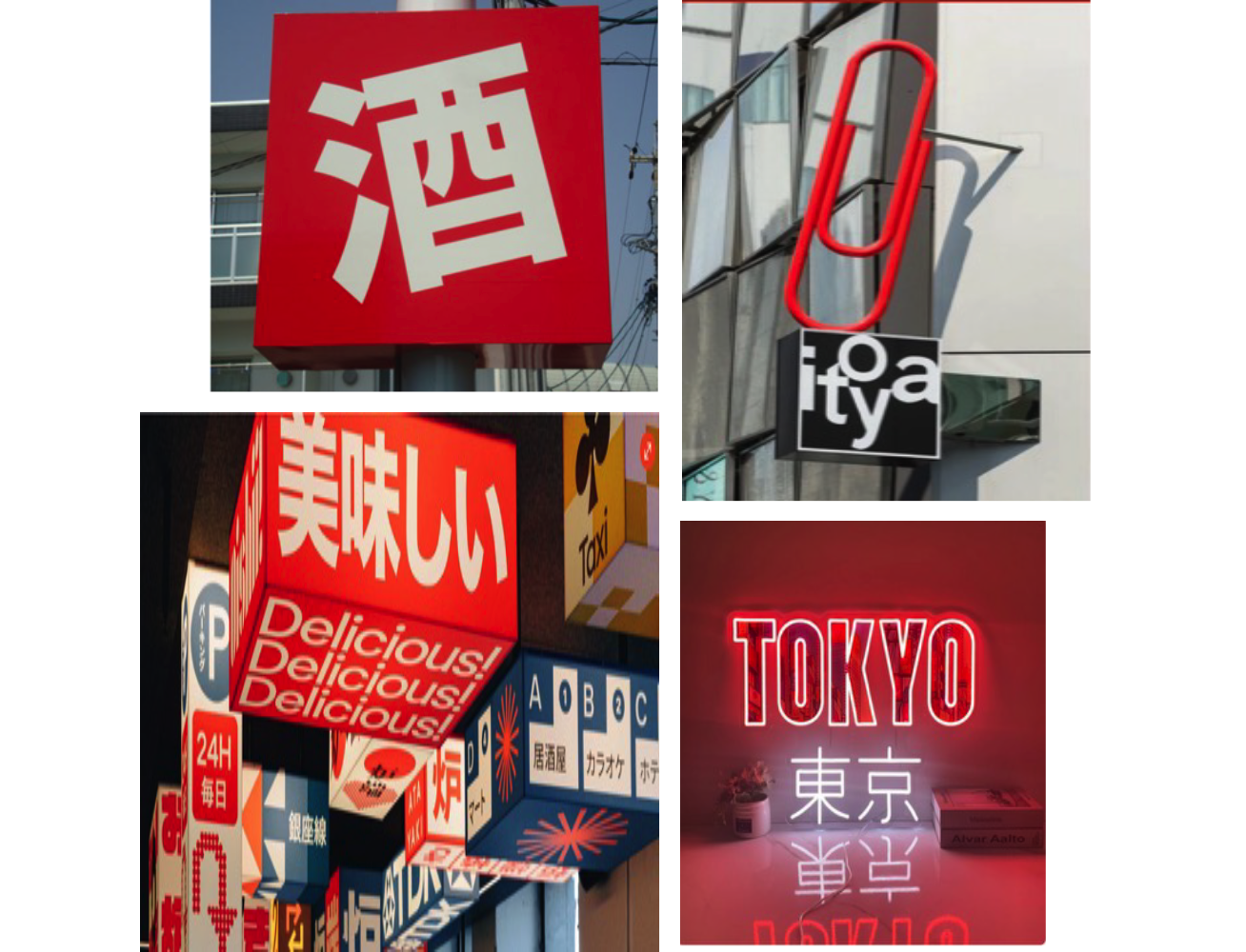
In Tokyo, design feels precise and layered. Space is limited, so information builds upward. Signs stack, overlap, and glow, creating a dense but carefully ordered visual field. There is a sense of control and intention in even the smallest details, where efficiency and beauty coexist.
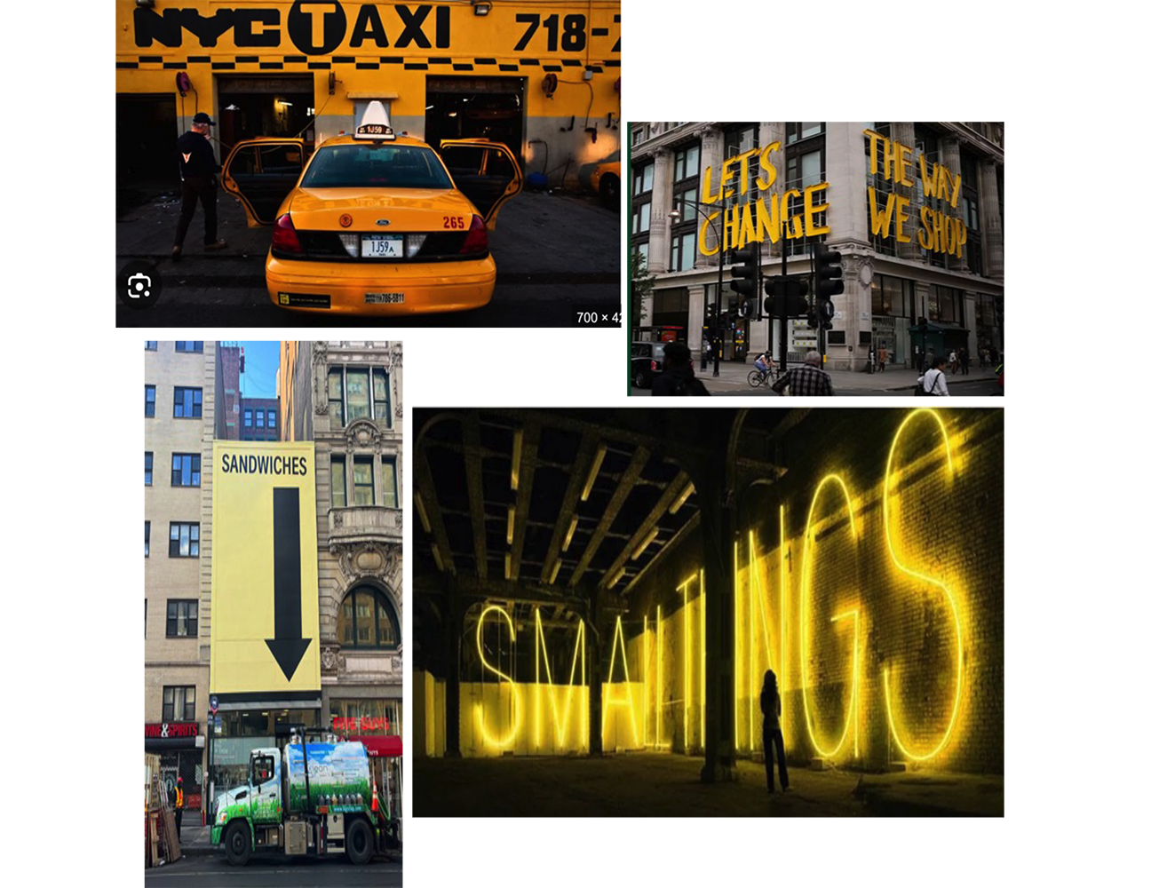
New York speaks in a different tone. Its design is bold, immediate, and unapologetic. The pace of the city demands clarity. Large type, strong contrast, and direct messaging dominate the streetscape. It is a place designed to be understood at a glance, where visibility is everything.
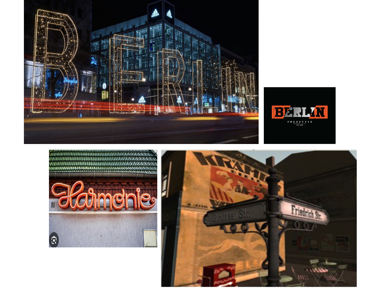
Berlin carries its history more visibly. Its visual language feels open, sometimes unfinished, often experimental. Old and new exist side by side, not always in harmony, but in conversation. Typography and signage lean toward expression, shaped as much by reinvention as by tradition.
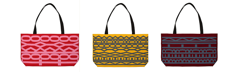
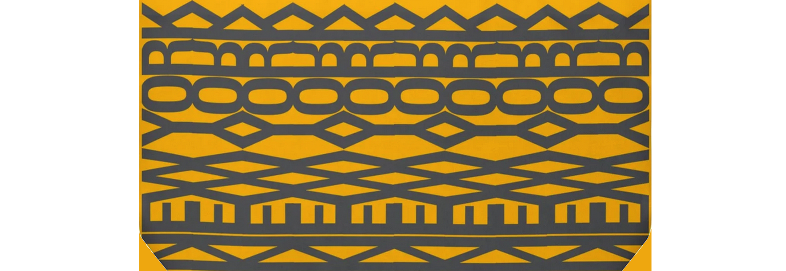
Inspired by the visual language of cities, we’ve designed a collection of Weekender tote bags. At first glance, they read as bold patterns. But look closer, and the city reveals itself. Each design is built from typography. Letters are repeated, layered, and transformed into rhythm and structure. The name of the city is hidden in plain sight, woven into the pattern. Like the cities that inspired them, these bags are about discovery. What you see depends on how closely you look.
Happy travels.
Courage Drifter